Monday, February 27, 2012

Big Boy Bed


Well, boy #2 will be turning 10 in March and we realized it'd be a good time to upgrade his sleeping quarters from the tent with a slide bed to something that would last him over the long haul. Great news for us is that this will be last bed we'll have to get him (let's hope.)  So goodbye, little guy bed hello big boy bed.
It also has a good amount of storage, which is great for smaller secondary bedrooms and kids' rooms with an ridiculous amount abundance of toys.
I was initially resistant to getting this bed because my other son has one that is very similar and I thought that was kind of weird

 but my husband reallllly wanted another storage bed and now that I think about it maybe it's just me that's weird.
The room has a long way to go (as evidenced by the paint samples taped to the wall) but at least our biggest purchase (literally and figuratively) is out of the way.

Monday, January 30, 2012

Back

After an a months-long hiatus from my little blog, I'm back up and running. This break was muchhh longer than I thought or ever wanted it to be as I had no decent camera and each time the husband and I were ready to take the plunge on a new first-ever DSLR camera, life would happen and the funds were needed elsewhere. You know, for food and clothing and other irritating necessities of life. And can i just say.... that I love, love, LOVE it.  (That's a lot of love, but it deserves it.)
The good news is not a lot has happened to warrant a blog post, but to get going again I thought I'd post a couple of additions to the 'ol homestead that I adore.
First is my little deal of table.  I'd long admired and pined for this table from Ballard Designs, but even at a somewhat decent price, it just wasn't one of those aforementioned necessities.  Then one day at Kohl's I cruised past the clearance section and found this table from the Elle decor collection for 70%(!) off, which if memory serves was $29.99. Now that I could make happen.  Here she sits right where I imagined:

It's not exactly the same as the Ballard version, but close enough for the pretty price.

My other lovely came to me in an even lovelier way.  I won a Z-Gallerie gift card give-way at Centsational Girl, one of my favorite (and one of the first I'd ever read) blogs.  I truly let out a squeal when I got her email that I'd won.  Z-Gallerie is right up my alley in terms of design.  Although, there are probably no less than 100 things I'd love to have from there, I knew instantly what I'd get with it.  This urn was calling my name the first time I ever saw it, but (again) the price was yelling at me to run away.  I knew that I probably could not (or maybe its 'would' not) bring myself to spend that much on an urn, but with a gift card that I'd WON, I was doing it. 
So, there she sits all white and pretty.  I sometimes even shoot a little wink her way as I walk by.  :)

And there we have it, couple little things that just give me a bit of thrill each time they catch my eye. Oh and also, so glad to be back.


Sunday, September 4, 2011

Hamptons Love

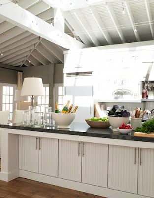
Years ago I discovered the Sotheby's Real Estate website while doing a search for Hampton's style homes. I know lots (and lots!) of home design lovers out there fell in the love with Hampton's beach houses because of the movie Something's Gotta Give.  I actually had liked this style before that because of my favorite cooking show, The Barefoot Contessa.  After the movie came out, that just reinforced my love of the style.  So, one of my favorite things to do is peruse that Sotheby's Hamptons site.  My design style is a very mixed bag but I really, truly adore the interior design style of those houses in the Hampton's. And if I were forced to pick a single style, that would be it.  I just feel most comfortable in that beachy, clean, airy, bright environment.  As such I have collected many, many, many pics of these spaces and wanted to share them today.  Starting with my favorite room of any house, the kitchen:

Even when the style is spot on for me, maybe a little too modern, etc. I still love the overall effect and feel.

I realize what draws me in most is the simplicity of nearly every home.  I don't know if, because these homes are for sale, they are staged this way, but I can't get enough of the uncluttered, clean, not overly decorated spaces. Like these dining rooms:
And these family rooms, dens and living rooms:
And bedrooms:
(all photos from Sotheby's Real Estate)
These spaces are my absolute inspiration for my own home.  Rooms like these are what say home to me and what I think of and refer to when choosing things for our home.  I just love me some Hampton beach house style.  I will do another post on outdoor spaces since I have a embarrassingly large growing collection of those spaces, too. 

Sunday, August 7, 2011

Another Bench Makeover


When we purchased our dining room table, chairs and hutch we also noticed a two-person bench that matched the chairs.  We didn't get it then because we felt we had just about met our maximum spending limit that weekend.  But.....a few weeks later and after we'd calmed down a bit about our big purchase (our largest ever on furniture) we thought we really should have gotten it.  I called the store and was told our design had been discontinued but we could have the floor model at a reduced price. Woo-hoo! The only drawback was that unlike our chairs we couldn't pick the finish or fabric. Fortunately the finish matched but we didn't care for the bright red patterned fabric:

We've lived with it for a couple of years like this with every intention of recovering.  A few weeks ago I was in a fabric store and the P. Kaufmann fabric (above) was discontinued to $5.99 a yard.  Nice.  It was perfect with my color scheme and it was upholstery grade.  So, finally I did my redo.
After recovering the bench I had quite a bit of fabric left, so I decided to recover the arm chairs to tie in it.


I hadn't been looking for fabric for this project that day, it just happened to be there and at a great price so I took it as a sign since we're phasing out the red accents in our home anyway. Just meant to be!
I tried to take pictures of the process when I had a serious camera malfunction (better than a wardrobe malfunction I guess!) but it was incredibly easy.  Just unscrewed the seats from underneath and tightly wrapped the new fabric right over the old and stapled down with a staple gun.  My only hiccup was that a couple of the screws had been stripped so I had to wait for my handy hubby to use some specialty tool to get them out.
For the price and time and effort investment I couldn't be happier.

Tuesday, June 21, 2011

Red No More

Well my poor blog has been silent since April because during a project I was doing that I planned to post my camera died. Just died. It will take a single picture and turn itself off. I have yet to get another because we'd like to save up for a really nice DRS digital Canon and both my husband and I are of the school of thought that we'd rather put all of our money toward what we really want then to buy something cheaper to hold us over.
I was really disappointed over not being able to do my blog until I realized I had collected hundreds (upon hundreds!) of inspiration photos and I could post to inspire myself.
My design style has evolved since we moved here in 2003. At the time I liked red but always did have a love of whites, blue-grays and neutrals. In the red phase we hung red curtains in our family room and had lots of red accessories. But now I want to move to the more neutral and light, bright design style
Of course, I have a ton of inspiration from other blogs. The one that currently has me obsessing inspired is Megan's home from the blog Honey We're Home.  Her kitchen is exactly what I've been looking for with a mix of white cabinets and dark stained ones.
 I also ADORE her family room and breakfast nook curtains.


Besides Megan's home I am also love, love, loving Ina Garten's (aka Barefeoot Contessa) kitchen featured as the 2009 House Beautiful Kitchen of the Year.


Once again:  LOVE it. And this is where I want to go. White cabinets, lighter curtains, more of a Hampton's beach house type feel.  My curtains are coming down in shortly and with my new camera (which we'll be getting in the next week or so-woo hoo!) I'll do before and after.

Thursday, April 28, 2011

Little Paint Project

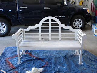
We have had this bench for years. In our previous home we also had a covered front porch and I always pictured a cute little bench there.  I saw this bench at a local home improvment store and knew it would be perfect and I loved it's design. 
When it came home with us it was a medium wood color.  After we moved to our current home I stained it much darker with a Minwax stain to a mahogany-type color.

Last summer I actually saw an almost identical bench in a movie painted white and LOVED it.  As I've said in the past I'm a huge fan of white and it's clean simple look. So with my boys help I primed and painted it.


Now I ADORE it and think it will stay white for the remainder of it's days.


It looks so fresh and inviting and has inspired me to spruce up my front porch even further.  I think I'll add a little coffee table and maybe a little white chair to match and enjoy cups of coffee or glasses of lemonade out here all summer long.

Tuesday, April 12, 2011

Tax Time Organizing

We filed our taxes several weeks ago but just this weekend packed up all of our 2010 stuff. We hadn't done this yet because we didn't want to make the mistake again this year of packing everything up only to receive documents in the mail weeks after packing up and having to go to our garage and dig out our box.  
This year we got REALLY serious and I made photo copies of all of our important documents that we need occasionally for things like insurance and sports sign-ups such as birth certificates, marriage license and social security cards to keep in our regular files and kept the originals in our fireproof safe.
 
And then I tackled the owners manuals of which, it seems, we have an endless supply.  You know, everything from the washer and dryer and KitchenAid mixer to my boys' electronic toys and husband's tools.  This is what I came up with:


I wanted to use the Martha Steward idea I saw on a show years ago of putting them all in plastic sleeves in labeled binders but didn't do this because it irritated my husband having to pull them out of the sleeves. I then thought of just hole-punching each one and putting it in a binder but doing that cut off information. So above is what I put together with what I had on hand.  I just recycled old file folders and labeled the categories on both the side of the file and the top for ease of finding what we needed. I put all the manuals behind each divider and stuck them in a bin I already had.
Now, I realize this isn't the loveliest thing to look at, but it stays in the office closet and I have to say it really is functional.   Since I've done this we've had to refer to several manuals and it gave me quite the thrill to go right to it AND my ultra-organized hubby even got a bit excited.  Yes, we're a little lame. But we do love us some organization!